Mapping the Industrial Fringe: Visualizing Well Expansion Near Chaco
Using time-based mapping to understand decades of oil and gas development surrounding Chaco Culture National Historical Park.
Data as Evidence: The Industrial Context of Chaco Canyon
In Preserving Chaco: Part 1, I focused on tools like LiDAR and 3D printing to better understand the form and scale of Chaco Culture National Historical Park itself. That work was about what has been preserved and how we can see it more clearly.
This post looks outward into patterns emerging within the broader region.
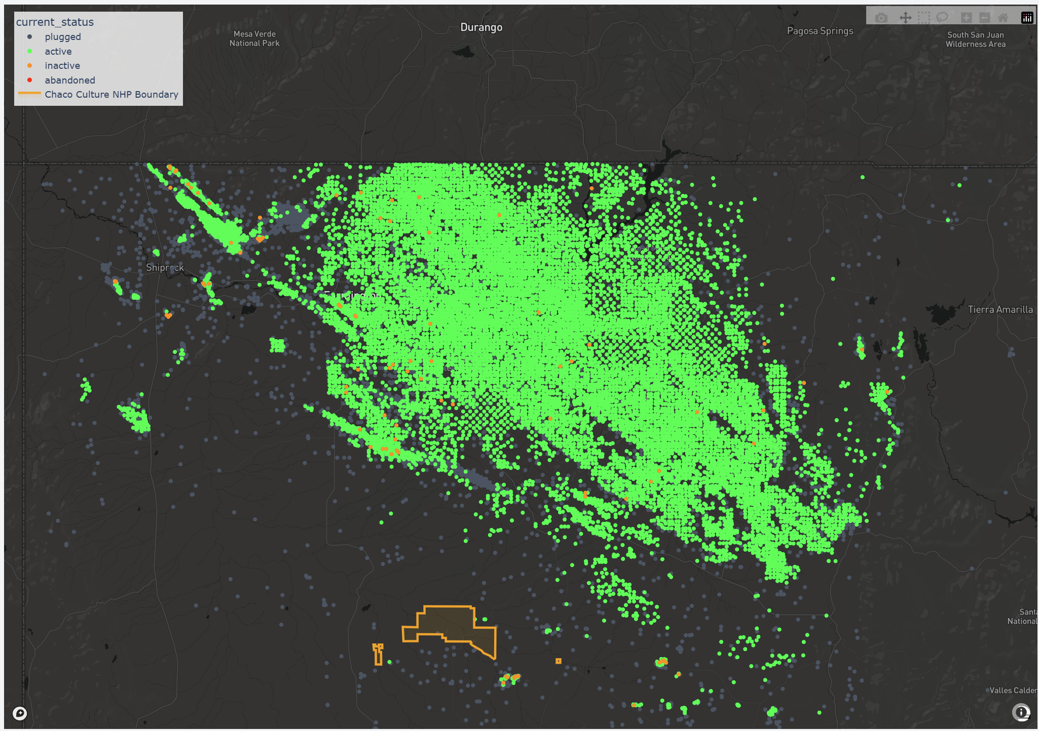
Chaco sits within the San Juan Basin, one of the most productive oil and gas regions in the United States. To understand the pressures facing the park, it’s not enough to know that development exists nearby. What matters is how that development has expanded over time.
Still images and static maps make it hard to grasp that change. I wanted a way to see when wells appeared, how quickly they accumulated, and how their spatial patterns evolved. That led me to build a Chaco Well Expansion Dashboard, an interactive map that visualizes oil and gas development year by year.
Seeing Change Over Time
Each point on the map represents an oil or gas well, tagged with the year drilling began and its current status. As the timeline advances, only the wells that existed at that moment are shown. New wells appear gradually, then in larger waves.
Seeing the data this way changes how it reads. Patterns that are easy to miss in tables or reports—clustering, bursts of activity, periods of relative slowdown—become visible.
Temporal Playback
The map plays forward one year at a time. Early decades show sparse development. Later years move faster and fill in more densely. The goal isn’t to overwhelm the viewer with information, but to make the pace of change easier to understand.
Geographic Context
Development only has meaning in relation to place.
For that reason, the dashboard includes the official boundary of Chaco Culture National Historical Park, pulled directly from National Park Service open data. This ensures the boundary shown reflects the exact and current administrative definitions rather than a static or approximate outline.
Seeing wells in relation to that boundary helps ground the visualization in a real landscape with cultural and legal significance.
Rendering at Scale
The map is designed to handle thousands of points smoothly, allowing viewers to zoom and pan without friction. Active wells are shown in green, while plugged or abandoned wells appear in muted gray. This makes it easier to distinguish ongoing activity from older development without adding unnecessary complexity.
How to Read This Map
For first-time viewers
-
Time playback
The animation shows only the wells that existed in a given year. As time advances, new wells appear. -
Color
Green points indicate active wells. Gray points represent plugged or abandoned wells. -
Boundary line
The outlined shape marks the official boundary of Chaco Culture National Historical Park. -
Zoom level
Zooming out reveals regional patterns. Zooming in highlights clustering and proximity to the park.
There’s no single correct way to view the map. Let it play through, pause at different points, or move backward to compare periods.
Why This Matters
This project uses the same analytical approaches I rely on elsewhere, applied here to a conservation context to understand how development has changed over time.
Temporal data visualization of GIS date is useful because it makes patterns visible. A single well on a map doesn’t say much and showing everything all at once obscures key parts of the narrative. Decades of wells shown progressively is the sweet spot, makeing it easier to see how development has unfolded and accelerated in the region.
If you’re interested, you can explore the dashboard here and examine the data directly.